No site found for codelikethis.herokuapp.com; using CodeLikeThis content.
Slides
Responsive Layout
- "Responsive" means that the layout changes and responds based on the width of the screen
- This allows for specific layouts for mobile phones, tablets, screen readers, and more
- Layouts can be redered conditionally based on:
- Screen size
- Pixel density
- Screen orientation
- Height/Width Ratio i.e. 11:9
Question: Why might this be important?*
What is Responsive Development?
- Responsive development is a technique that displays content well regardless of the device it is being viewed on
- This concept is increasingly important, not all users are desktop browsers
- In 2017 and 2018 more than 50% of web traffic was from mobile devices
Responsive Layout: Media Queries
- CSS3 introduced media queries, which allow developers to apply CSS properties to devices which match rules
- Media queries are the backbone of front-end responsive development with HTML and CSS
- Applying CSS to specific screen widths allows for changing the layout and styles based on the size of a device
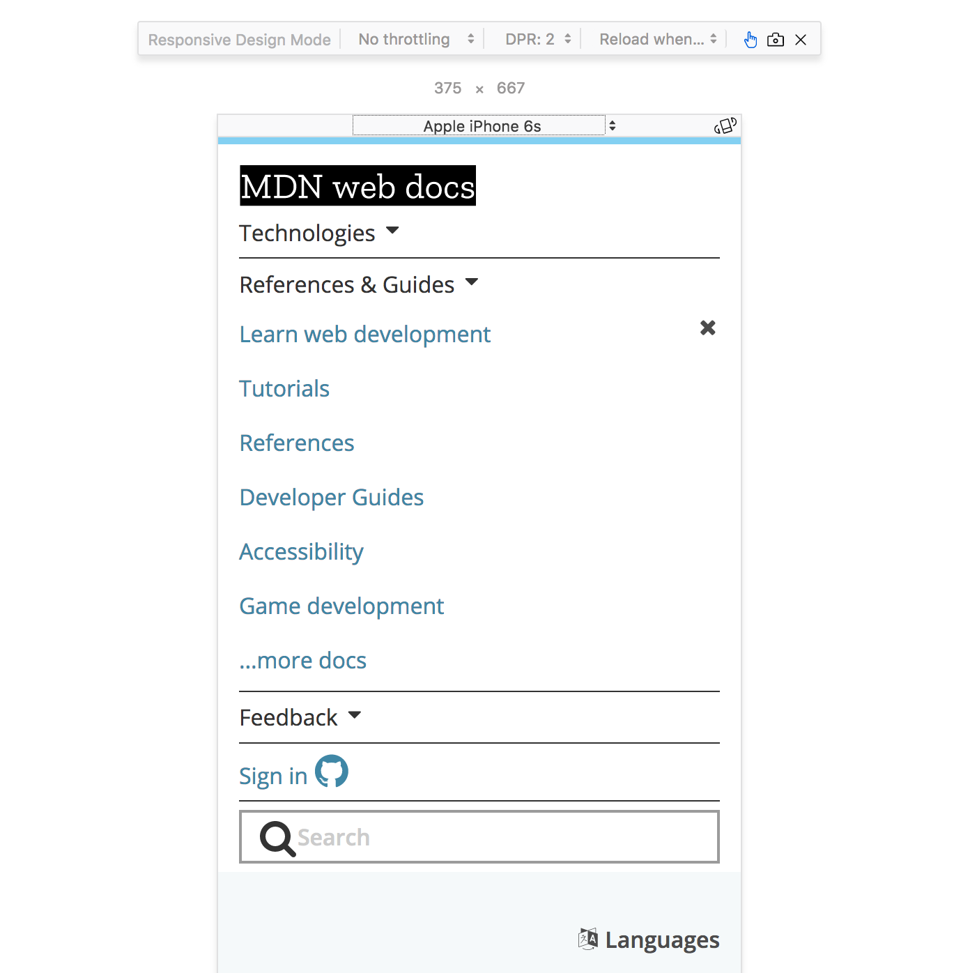
Mobile Device Simulator

Using Media Queries
- Media Queries (
@media (some_condition) { }) cause different CSS rules to be applied on different screens
Example
This will make our .nav element position relative when the media type is print
// Default position layout

.nav {
  position: absolute;
}

// Print media only layout

@media print {
  .nav {
    position: relative;
  }
}
Media Features
Each feature is a characteristic of the user-agent
| Query | Description |
|---|---|
| width | the width of the viewport |
| all | TRUE if the device responds to media queries |
| resolution | Pixel density of the output device |
| color | Number of bits per color component of the device |
| pointer | Is the primary input mechanism a pointing device |
| hover | Does the primary input mechanism allow the user to hover |
Media Query Conditionals - AND
Only change the layout to position: relative; when
- The media is
screen - AND
- The screen width is greater than or equal to 768 pixels
@media screen and (min-width:768px) {
  .nav {
    position: relative;
  }
}
Media Query Conditionals - OR
NOTE: OR is the , (comma) in a Media Query
Only change the layout to position: relative; when
- The media is
screen - OR
- The screen width is greater than or equal to 768 pixels
@media screen, (min-width:768px) {
  .nav {
    position: relative;
  }
}
Mobile-First Development
- Developing mobile first means to start styling out your web page for a mobile device, and then modify the layout for a desktop browser
- The result of this is modifying your CSS as screen sizes increase, rather than modifying your CSS as screen sizes decrease
- In other words, your media queries will be written for minimum widths, not maximum widths
- Tip: You can also set media queries in-between two screen sizes